
A poor user interface can make or break a CRM.
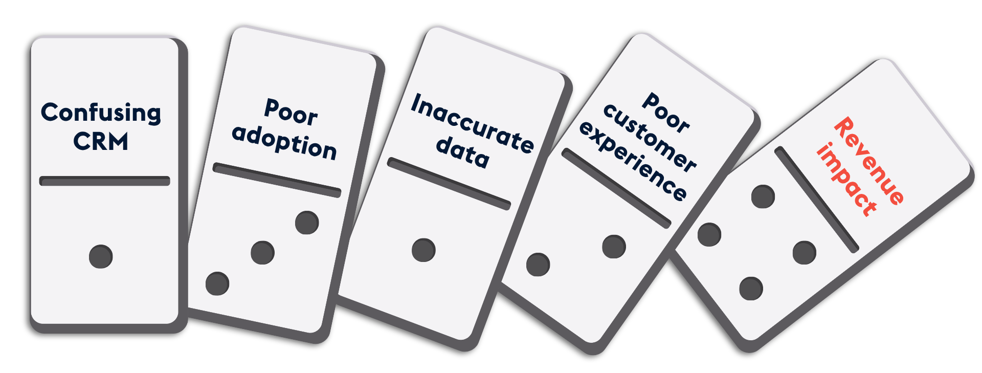
It’s no coincidence that around two-thirds of CRM implementations fail. In our work with hundreds of companies, we’ve seen poor UI as one of the biggest culprits behind that failure.
Take one recent project: a client told us their sales team spent 10–15 minutes manually creating a lead in their legacy CRM every time a customer enquired. With six enquiries a day, that’s over an hour lost to data entry per rep, per day.
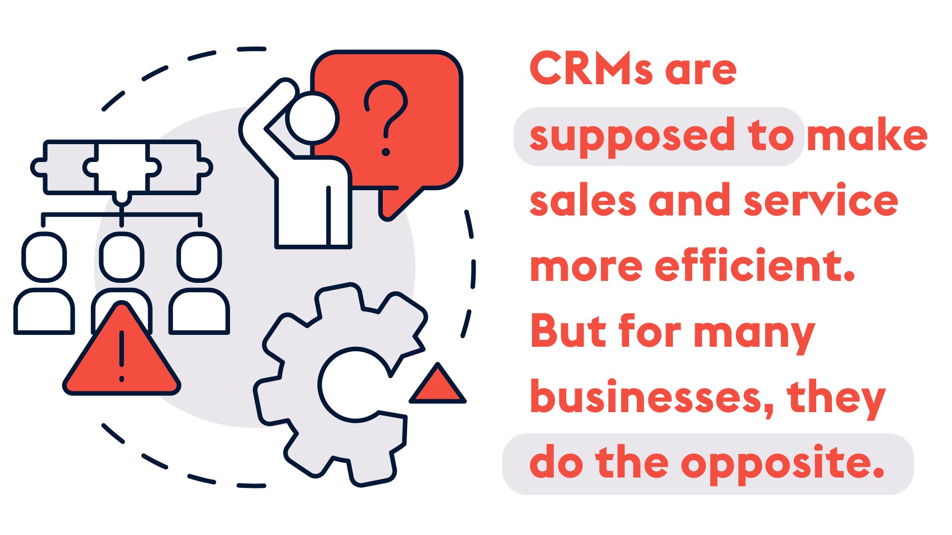
CRMs are supposed to make sales and service more efficient. But for many businesses, they do the opposite.
Of course, there are many reasons a CRM might fail. But user interface issues are more common and more damaging than most teams realise.
In this article, we’ll discuss:
Let’s be frank: most CRMs are a mess.
When staff log in, they’re met with a flood of confusing information and overly complex workflows. It’s no surprise many give up and resort to workarounds.
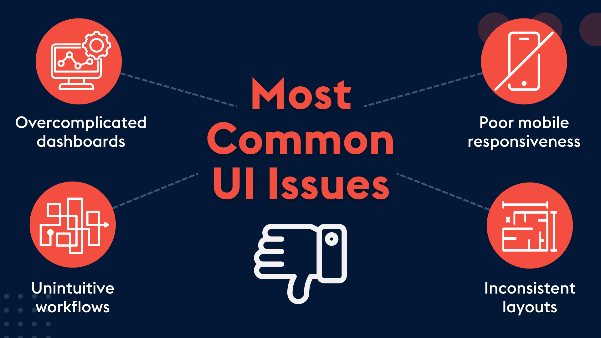
We’ve seen our fair share of clunky, frustrating CRMs. Here are some of the most common UI problems we encounter:
CRMs are powerful tools, capable of surfacing all kinds of data. But too much information can be just as bad as too little.
On one recent engagement, a client showed us their €150k+ instance of a leading CRM. The dashboard was crammed with graphs, charts, and widgets — most of which no one could make sense of.
A good CRM should tell a clear story based on the user’s role:
Instead, most CRMs overwhelm users with irrelevant information.
Modern CRMs are flexible. You can customise them to reflect your processes. In theory, that’s great. In practice, it often leads to chaos.
We regularly see workflows that involve endless clicks, form fields, and copy-paste steps across modules. Employees end up frustrated and disengaged.
That doesn’t mean you shouldn’t customise workflows, but you need to do so carefully. Every step should be logical, minimal, and truly helpful.
Many companies invest time in streamlining their desktop UI but neglect the mobile experience.
Take SugarCRM, for example. We’ve seen companies where the mobile app displays every module on login. The result? Confusion, clutter, and users who avoid the app altogether.
Given how often field reps and remote workers rely on mobile, this is a missed opportunity.
Another common issue is a lack of consistency between modules.
The Accounts page might look completely different from the Contacts or Opportunities pages. Without a unified layout, users struggle to navigate and lose confidence in the system.
A CRM should feel intuitive, like second nature. If every screen works differently, users won’t explore beyond the basics.
Most companies know their CRM could be better. But is it really a problem if it’s a bit clunky?
It’s an understandable view, but in our experience, a poor UI can have serious consequences. Here are some of the issues we often see when CRMs aren’t designed with the user in mind:
We’ve helped dozens of companies roll out new CRMs, migrate from legacy systems, or improve the layout of their existing setup. Over time, we’ve seen a few key principles that consistently lead to a better user experience.
Most CRMs come as blank slates. The out-of-the-box setup may be functional, but to really be effective, the interface needs to be tailored to your users.
Salespeople should see tools and data relevant to their deals. Customer service reps should see case history and past interactions. Executives don’t need detailed notes — they need dashboards that surface key business metrics at a glance.
Each user should see a CRM that reflects their role, showing the information they need based on what they do and how they work. They should still be able to explore further, but their main view should remain focused, clear, and relevant.
This may sound obvious, but it’s a common issue. Too many CRMs try to do too much, cramming in dashboards, widgets, and endless data fields.
It’s worth taking a step back and asking: what do users actually need to see? Remove the noise, and your team will be more confident, more efficient, and more engaged.
Also revisit workflows, modules, and custom features. Modern CRMs like Sugar make it easy to customise through tools like Sugar Studio (without needing developers). That’s a good thing. But more tools aren’t always better. Without proper training and purpose, they often lower adoption.
Your CRM should support your company’s objectives, not get in the way. This means ensuring data feeds into dashboards that give decision makers a clear view of what’s happening across the business. If leaders can’t get straightforward, reliable insights from the CRM, it isn’t doing its job.
Ultimately, the true measure of a CRM’s success is whether people actually use it.
Are they logging in regularly? Is it helping them do their job more effectively? Do they find it useful?
If the system is frustrating, confusing, or slows people down, it’s a sign the interface needs to be rethought.
In a recent engagement with a company in Dublin, we discovered their team had customised pipeline stages in SugarCRM in a way that forced them to export data to Excel, make changes manually, then re-import it back into the system.
We reviewed the SugarCRM setup and made a few simple changes. Within 30 minutes, we’d redesigned the process so sales reps could log everything directly in the CRM with just a couple of clicks. The result? The process is now 10 times faster, with five times fewer clicks — no spreadsheet required.
This is what happens when you focus on UI. Whether it’s a full architectural overhaul or a few smart tweaks, improvements to the user interface can transform how your team works — saving time, reducing frustration, and driving adoption.
At Provident, our SugarCRM experts can help you to:
Contact us today for expert advice and hands-on support to get more value from SugarCRM via the link below.